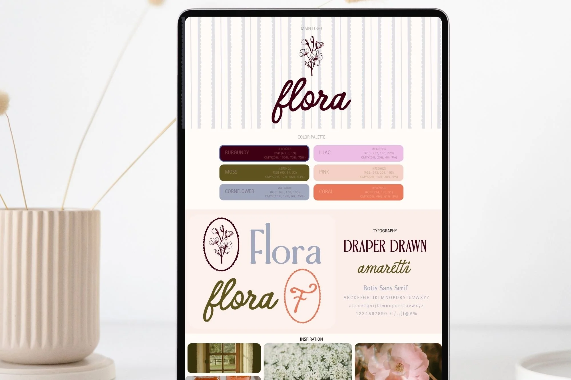
4 Fall Color Palettes + Hex Codes | Modern Inspiration
I’m so ready for fall that I’m about two weeks away from pulling the leaves myself.
Naturally, that means fall colors are starting to sneak into everything I’m designing.
But I’m not quite ready to cover the world in pumpkin orange and brown. These four fall color palettes pull in the richer, warmer colors of the season, then mix them with a few slightly unexpected shades: soft pink, periwinkle, dusty rose, coral, and olive.
The result is color inspiration that leans into fall without going full fall.
Save your favorite for your next brand, website, Canva project, or inevitable seasonal color-palette rabbit hole.
Fall Color Palette 01: Olive + Chocolate
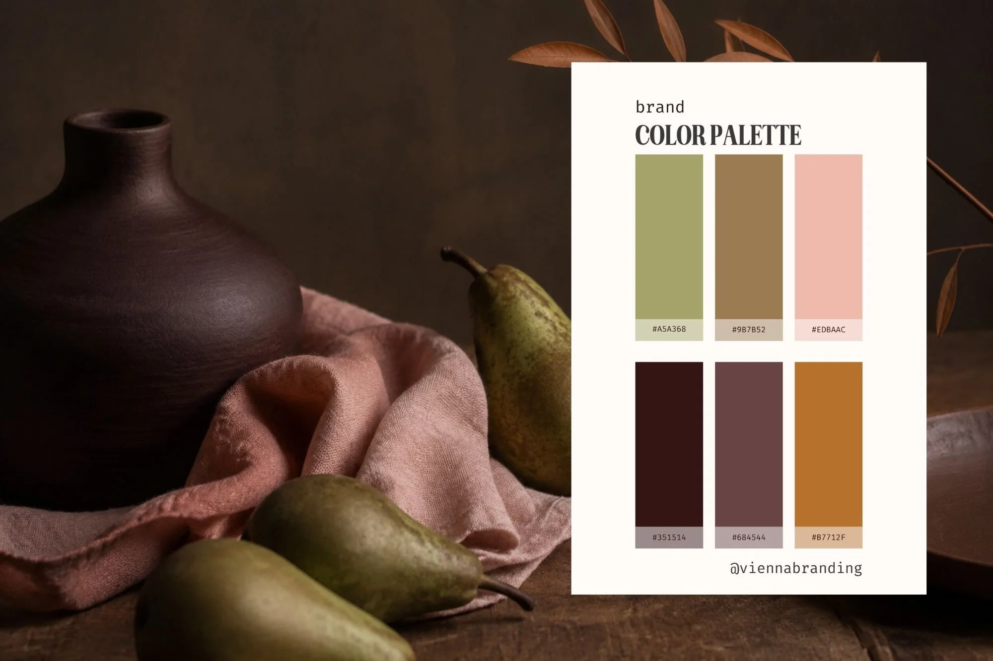
HEX CODES:
#A5A368 · #9B7B52 · #EDBAAC · #351514 · #684544 · #B7712F
Olive, chocolate brown, dusty peach, and warm cognac make this the earthiest of the four.
The deep brown gives the palette a rich foundation, while the olive and cognac bring in those unmistakable fall tones. The soft peach keeps the whole thing from becoming too dark or rustic.
For branding, this combination would be beautiful for a photographer, florist, boutique, interior designer, wellness brand, or creative business that wants to feel warm, established, and approachable.
Fall Color Palette 02: Oxblood + Dusty Pink
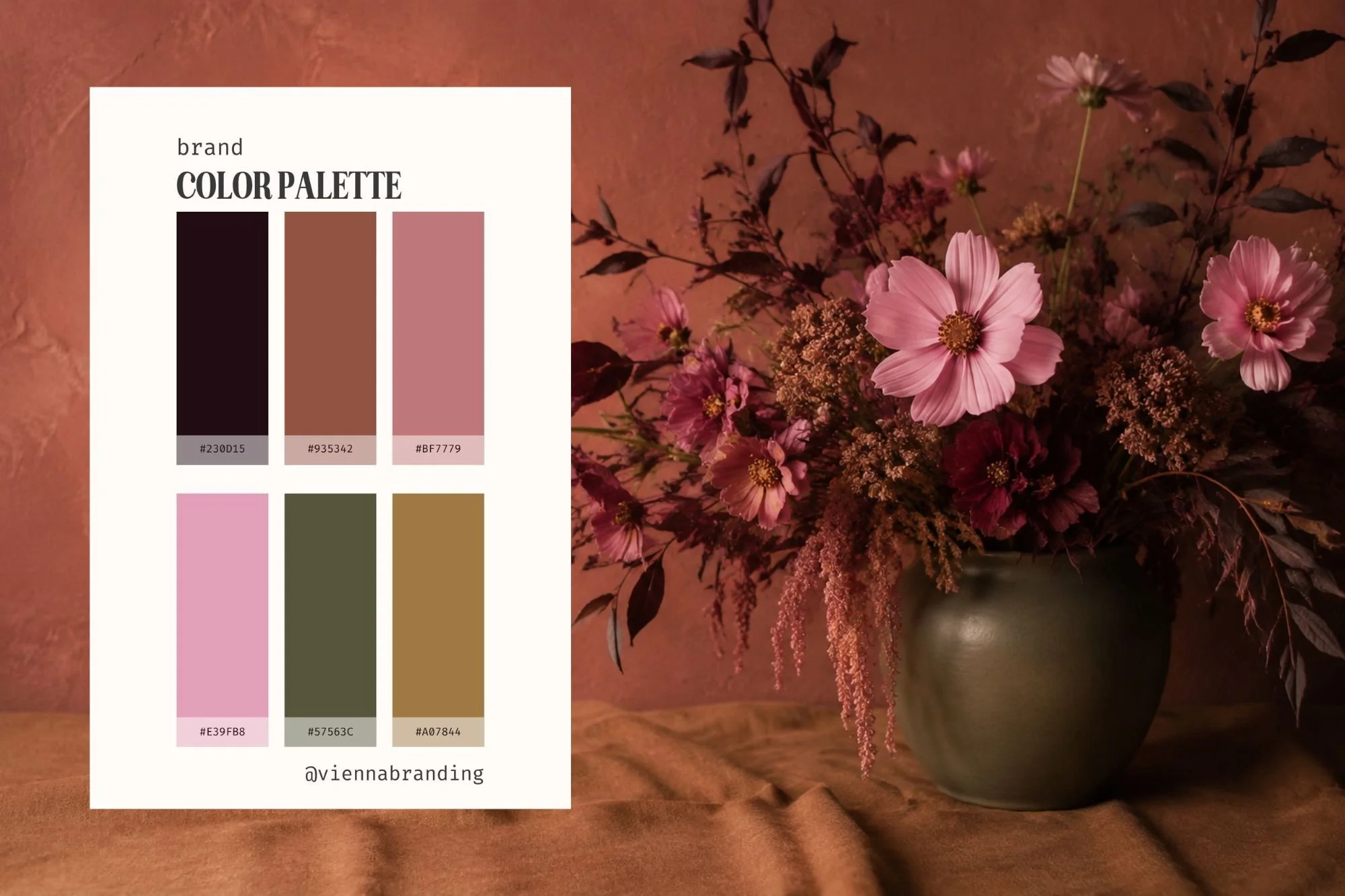
HEX CODES:
#230D15 · #935342 · #BF7779 · #E39FB8 · #57563C · #A07844
This might be the romantic one of the bunch.
Deep oxblood and olive give it that moody fall foundation, but dusty pink and rose soften everything up. The warm brown ties the two sides together without making the palette feel overly sweet.
It’s feminine, but not precious. Moody, but not heavy.
I could see this working beautifully for a wedding professional, photographer, boutique, beauty brand, florist, or service-based business looking for a feminine fall color palette that still has some depth.
Fall Color Palette 03: Olive + Periwinkle + Coral
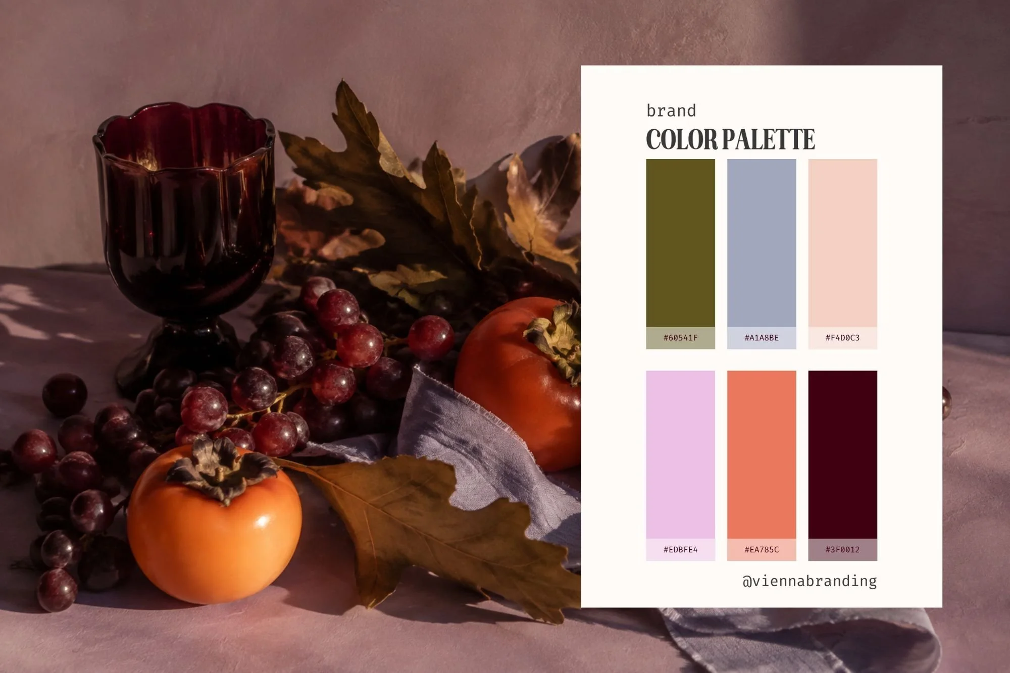
HEX CODES:
#60541F · #A1A8BE · #F4D0C3 · #EDBEE4 · #EA785C · #3F0012
Proof that a fall color palette doesn't actually have to look like a fall color palette.
Deep olive and burgundy anchor this combination in autumn, while periwinkle, lavender-pink, peach, and coral make it feel completely different from the colors we normally associate with the season.
This is the palette I'd choose for a brand that wants to feel creative, colorful, and a little unexpected.
It would be especially fun for a boutique, photographer, creative studio, beauty business, stationery brand, or anyone who loves color but still wants their brand to feel polished.
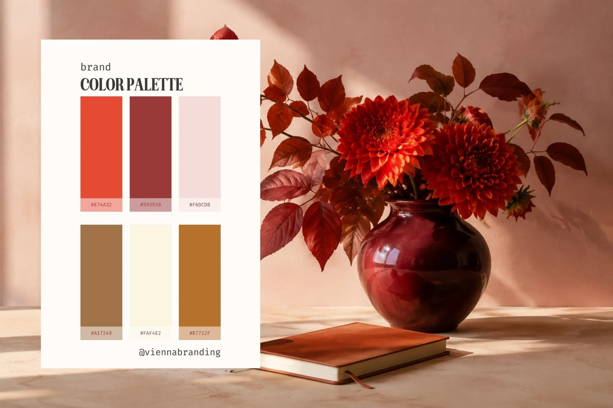
Fall Color Palette 04: Tomato Red + Cognac
HEX CODES:
#E74A32 · #993938 · #F6DCD8 · #A17249 · #FAF4E2 · #B7712F
This one feels like that first stretch of fall when you're mentally wearing a sweater but it's still 78 degrees outside.
Tomato red and rust give it plenty of warmth, while burgundy and cognac bring in the richness you'd expect from an autumn palette. Pale blush and creamy ivory keep everything feeling fresh and modern.
It's warm and bold without becoming overly seasonal, which makes it especially useful for branding.
For a business that wants to feel confident, welcoming, and full of personality, this palette gives you plenty to work with.
How to Use Fall Color Inspiration in Your Brand
Here's the thing about seasonal color inspiration: your brand doesn't need to look seasonal.
You can love a fall color palette without turning your website into a pumpkin patch every September.
Instead, pay attention to why the colors work together.
Fall palettes tend to have beautiful depth. Rich burgundy sits next to soft cream. Olive gets paired with blush. Chocolate brown grounds a lighter, unexpected color like pink or blue.
Those relationships can translate beautifully into a brand you use all year.
Start by choosing one or two colors to do most of the heavy lifting. A deep brown, burgundy, olive, or warm neutral can become your primary brand color.
Then bring in your lighter supporting colors for backgrounds and larger areas of your website or marketing.
Finally, let your most interesting color be the accent.
That coral, dusty pink, periwinkle, or tomato red doesn't necessarily need to cover half your website. Sometimes a little bit of an unexpected color is what makes the entire palette memorable.
The goal isn't to use every color equally.
It's to give every color a job.
Which Fall Color Palette Is Your Favorite?
Are you going earthy with Palette 01, romantic with Palette 02, unexpected with Palette 03, or warm and bold with Palette 04?
Save your favorite palette and use the hex codes the next time you need a little color inspiration.
And if choosing the colors is only the beginning...
Want the Whole Brand to Go With It?
A good color palette can completely change the direction of a brand. But it's when the colors, fonts, logos, imagery, and design direction all start working together that everything really clicks.
That's exactly why I created the Vienna Brand Kits.
Each kit gives you a thoughtfully designed visual direction you can customize for your own business, without spending hours trying to figure out which font goes with which color or wondering why everything in Canva still feels slightly... off.