Design Trend Obsessions!
If your brand (or your eyeballs) have been feeling a little uninspired lately, you’re not alone. Lately, I’ve been deep in a design spiral saving, screenshotting, and mentally rebranding everything I see. And wow… the vibes are strong right now.
From scrapbook chaos to illustrated sardines (I said what I said), these are the 5 trends I’m loving lately. They’re bold. They’re quirky. They’re full of personality. So if you’ve been craving something a little different, something that feels more “main character energy” and less “blah beige,” keep reading.
1. The Scrapbook Effect
Tape, scribbles, torn edges, layered textures—this trend is messy in the best way. It gives digital design that analog, handmade touch that feels nostalgic and totally fresh at the same time.
It’s perfect for brands that want to feel approachable and real—like you're flipping through your cool friend's journal from 1999. You know the one.
Why it works: It adds texture, depth, and personality—especially in a world full of flat, polished templates.
2. Bright 80s Colors
Hot pink. Teal. Electric purple. Basically, the color palette of your Lisa Frank pencil pouch (you know the one). These saturated shades are making a comeback in the best way, and I’m not mad about it.
They’re bold, they’re joyful, and they stop the scroll fast.
Why it works: Bright colors create instant energy and are amazing for catching attention—especially in content-heavy feeds.
3. Folklore Feels
This one’s giving embroidered florals, hand-drawn animals, soft textures, and storytelling vibes. Think cottagecore meets vintage fairytale—with a hint of Scandinavian charm.
Perfect for brands that want to feel thoughtful, artisan, or magical without being over-the-top whimsical.
Why it works: This aesthetic taps into emotion and memory, which makes a brand feel more personal and meaningful.
4. Cowboy Energy
Retro Western fonts, dusty tones, bolo ties, and just the right amount of grit. It’s giving modern cowgirl, small-town rebel, or road trip dreamer. I’m seeing this pop up in brand visuals that want to feel grounded and cool—especially for product-based businesses and edgy lifestyle brands.
Why it works: It stands out from the sea of “clean girl” brands and adds personality with a little attitude.
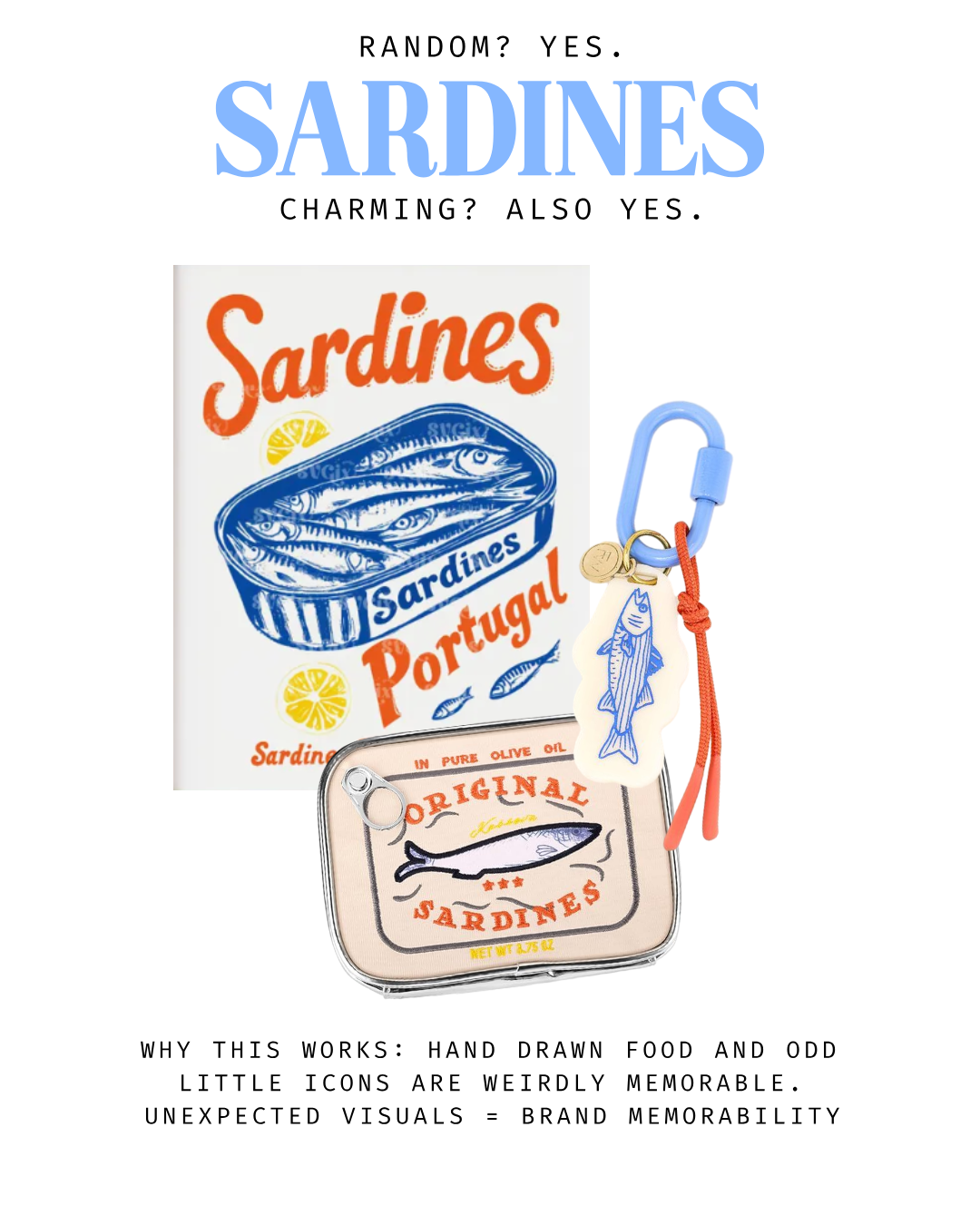
5. Illustrated Sardines (Yes, Seriously)
I know it sounds random. But these quirky little fish, and other odd, illustrated objects are showing up everywhere from packaging to print design. It’s giving “unexpected, but charming.” Weird in a good way. And people remember it.
Why it works: Visuals like this are unexpected and offbeat in a way that feels artsy and fresh. They make people stop, smile, and remember you.
Final Thoughts
Whether you're a fellow designer or a small biz owner dreaming of a rebrand, I hope this gave you a few ideas to pin, screenshot, or just vibe with.
Design doesn’t have to be perfect or polished to be powerful. It just needs to feel like you.
So tell me: which one of these trends are you loving most right now? Or which one totally surprised you?


